Inspired by the concept of a location being its own character. A love story to all the memorable spaces and places that have graced our screens, big and small, over the years. An exploration of a singular place across different time periods, with an owner as mysterious and timeless as the location's origins. It is at once: a secret society for female journalists in the 1890s – roaring speakeasy with a hidden operation in the 1920s–a modest diner with suspicious clientele in the 1950s – concert venue that skyrockets bands to stardom in the 1980s.
All graphics researched, designed, and digitally rendered by me.
[personal project]
1890s

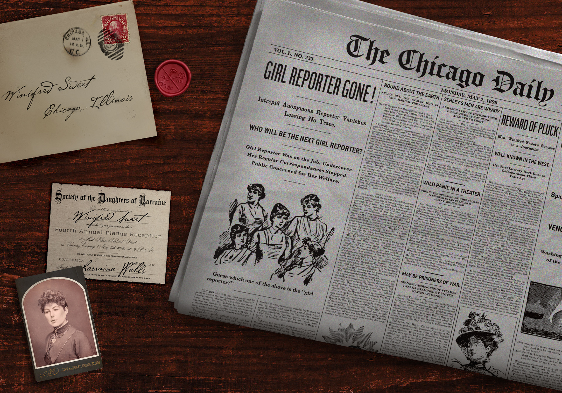
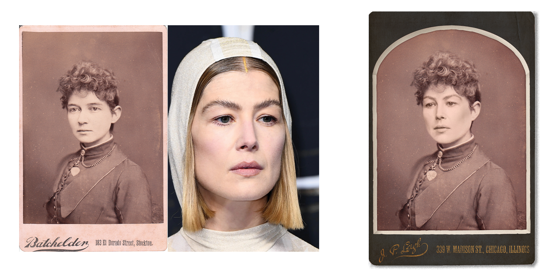
CARTE DE VISITE: an early version of a 'photo in wallet' mounted behind a cardstock frame. They varied in size but were extremely popular in the late 1800s. Distinctive styles and embellishments of the late 1890s in particular are curved edges, additional mats, and darker frame colors. This photo composite was made placing the face of the actress onto an actual 1890s dated CDV scan, adjusted the skull shape + ear placement to better match, and enhanced the lighting to match the flash lighting in the original photo.
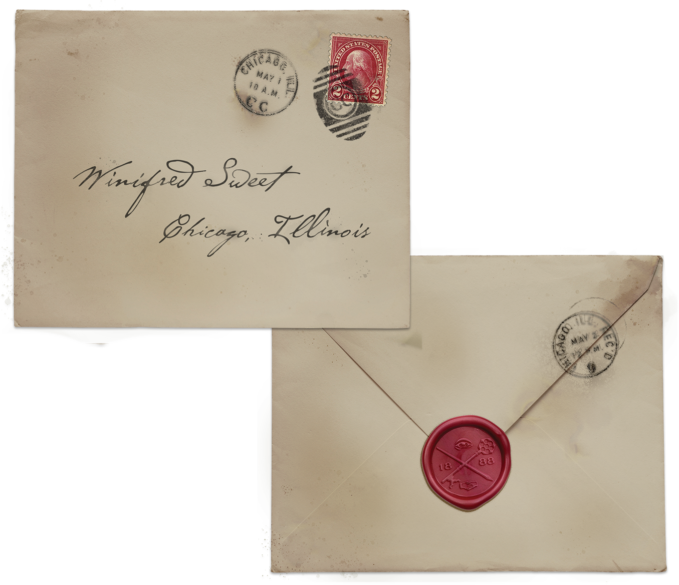
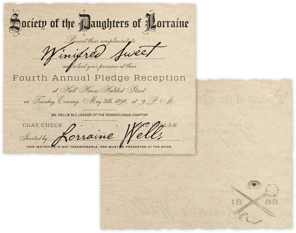
SOCIETY INVITE: linen paper invitation to the secret society, printed + inked, with engraved stamp on the back and matching wax seal. Design + scale based on researched invites to other altruistic and masonic societies of the time. The envelope is worn and dirty from transit, with appropriate stamps and postmarks. No return address, adding to the mystery of its origin. A keen eye could catch the symbol matches the markings, though blurry, on Lorraine's necklace in the CDV.
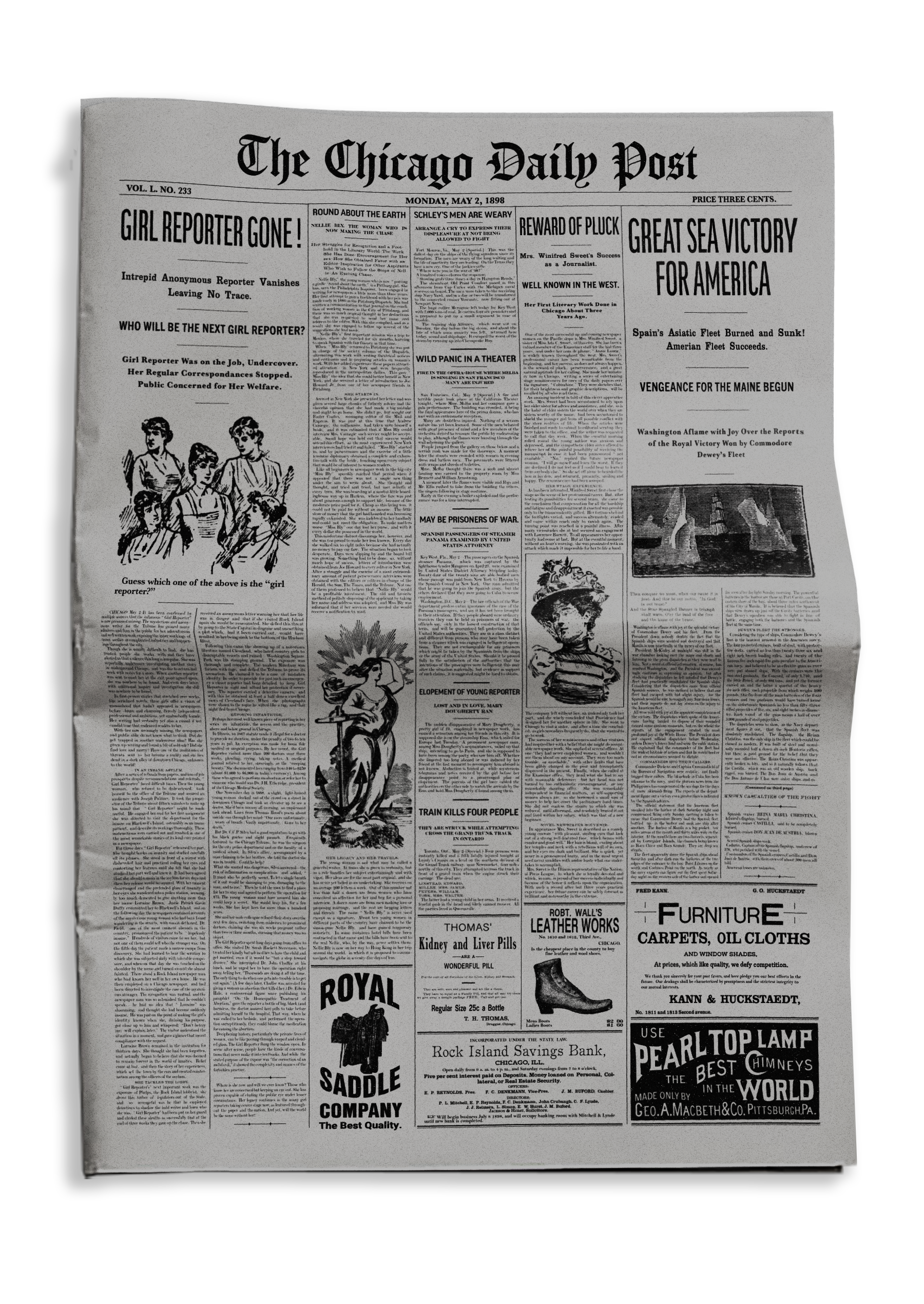
NEWSPAPER: based on era and location specific newspapers of the time in layout + font choice, with actual articles from the time period supplementing the story specific main article. This front page was mocked up to show the content + intent of a full newspaper spread - as you wouldn't normally see advertisements on a front page, but I included them to show examples of what more might be seen inside.
1920s

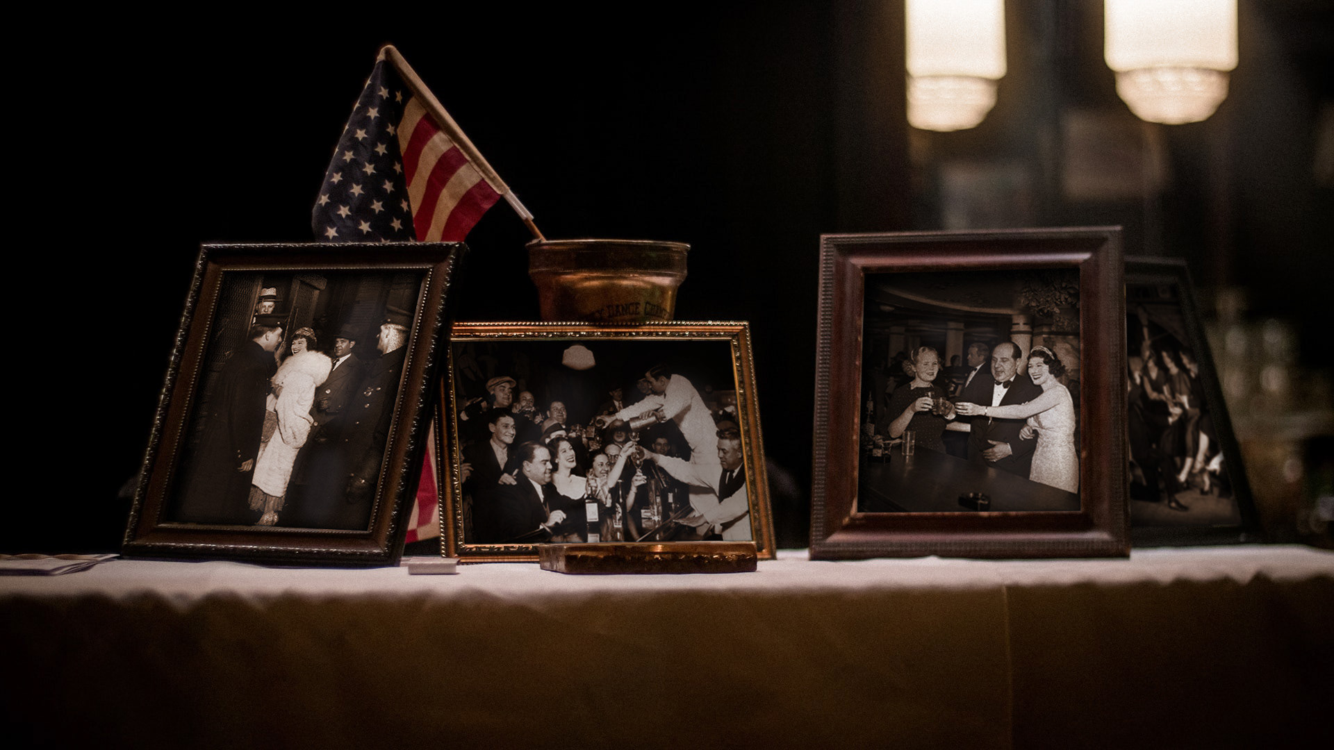
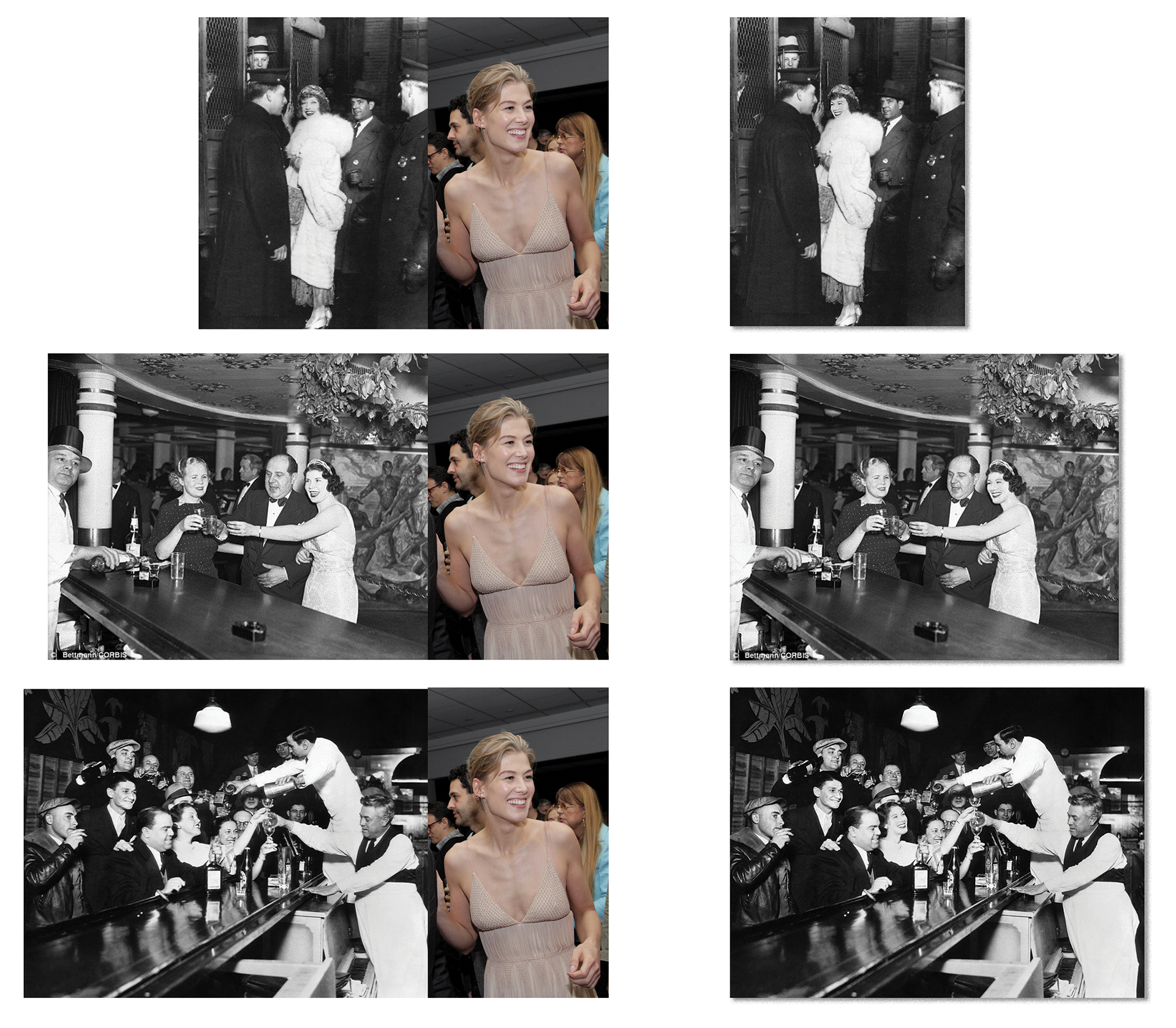
PHOTOS OF LORRAINE: As a socialite and actress turned speakeasy owner, Lorraine is the talk of the town and knows all the important people in the Chicago scene. Proudly displaying her with her patrons in photographs throughout the bar. Actress face photo used across three different source images to show adaptive range in photo compositing. Adjusted scale, grain, light source to blend the two together - as well as editing body + neck shape to create continuity between the three photos. Digitally placed in frames with shadows.
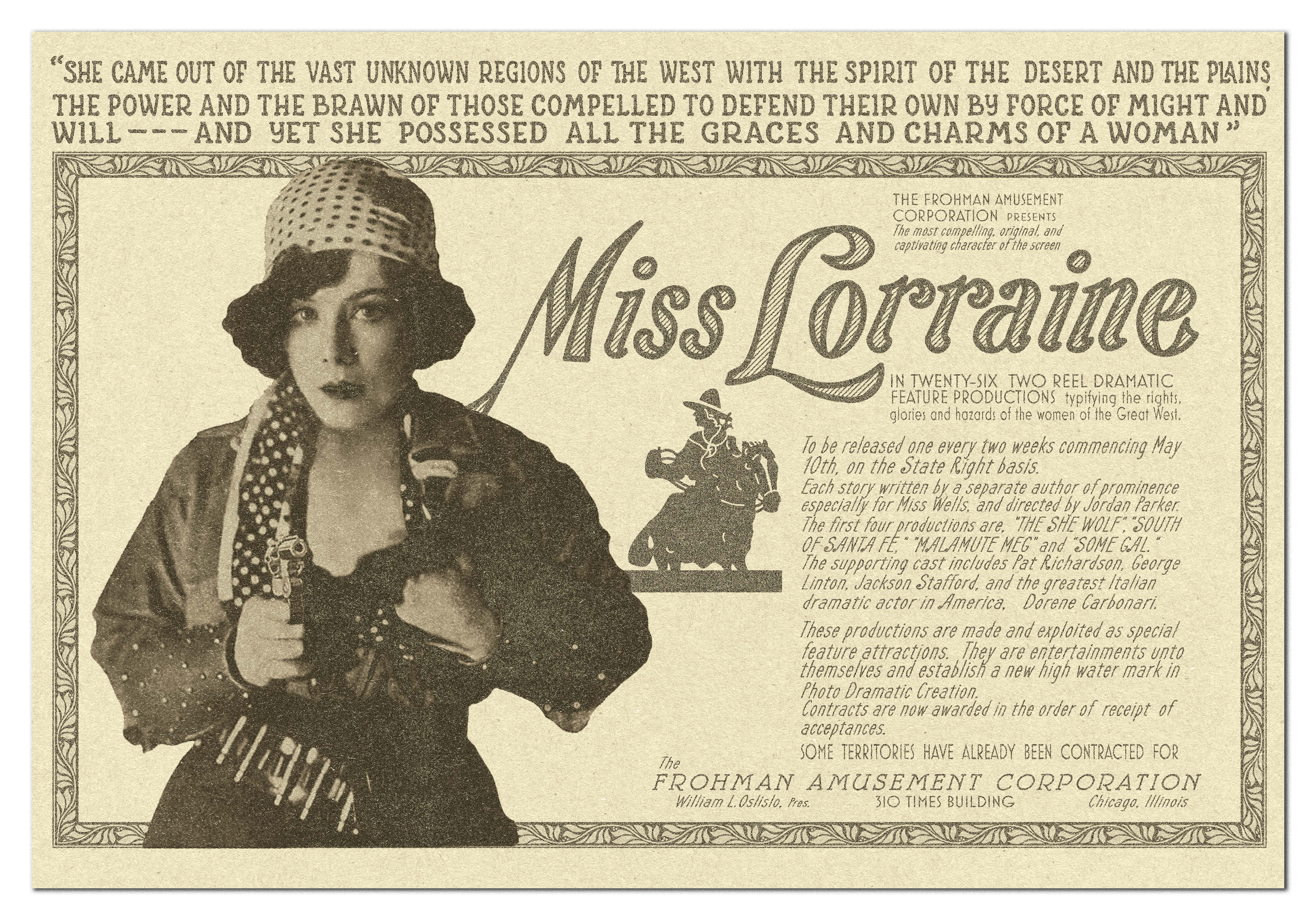
MOVIE POSTER: The 1920's Lorraine is heavily based on real life immigrant, speakeasy owner, and actress Texas Guinan and this poster is a faithful recreation of a 1919 ad for one of her films! Something she would've kept and proudly displayed in the speakeasy. Featuring photo composite of main actress + source photograph, multiple custom font recreations, silhouette artwork recreated into vector lineart, custom border recreation, and paper texture and grain added for accuracy.
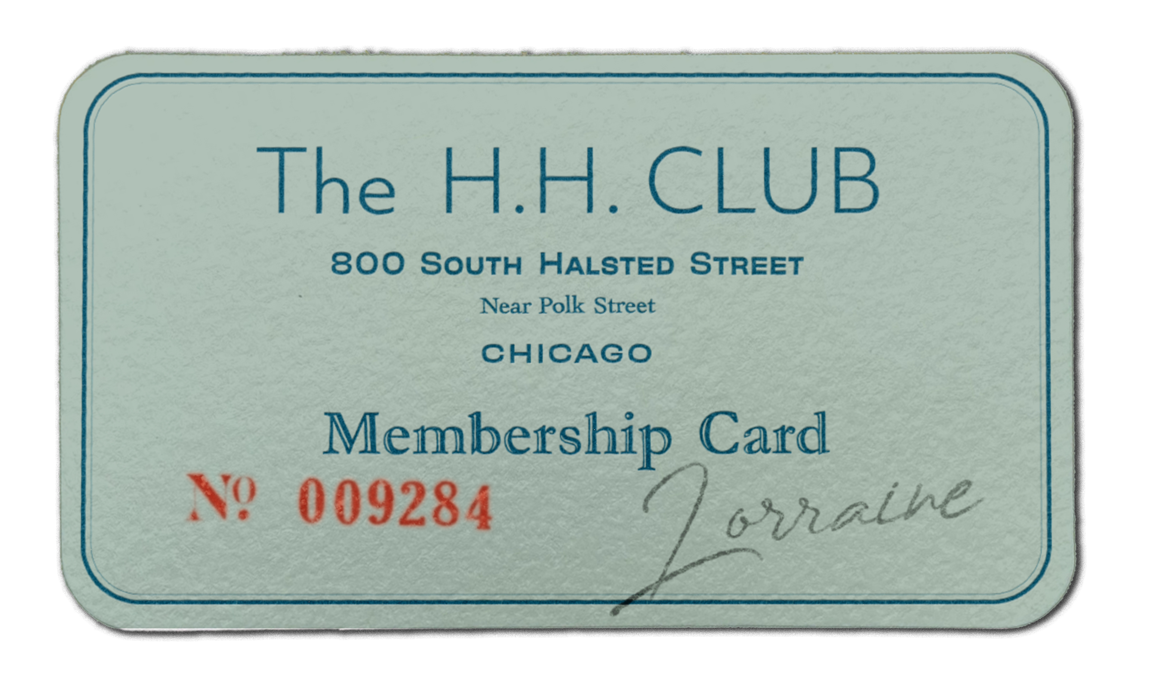
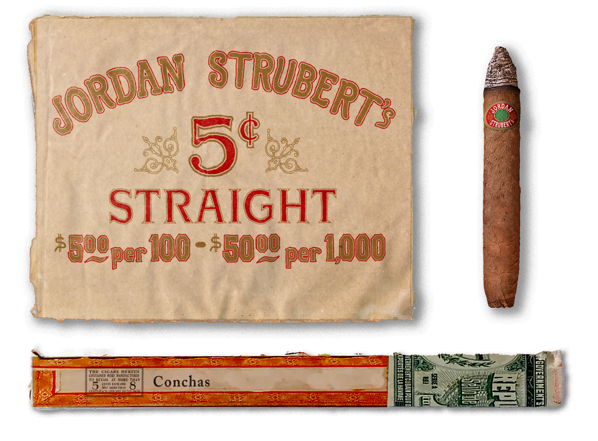
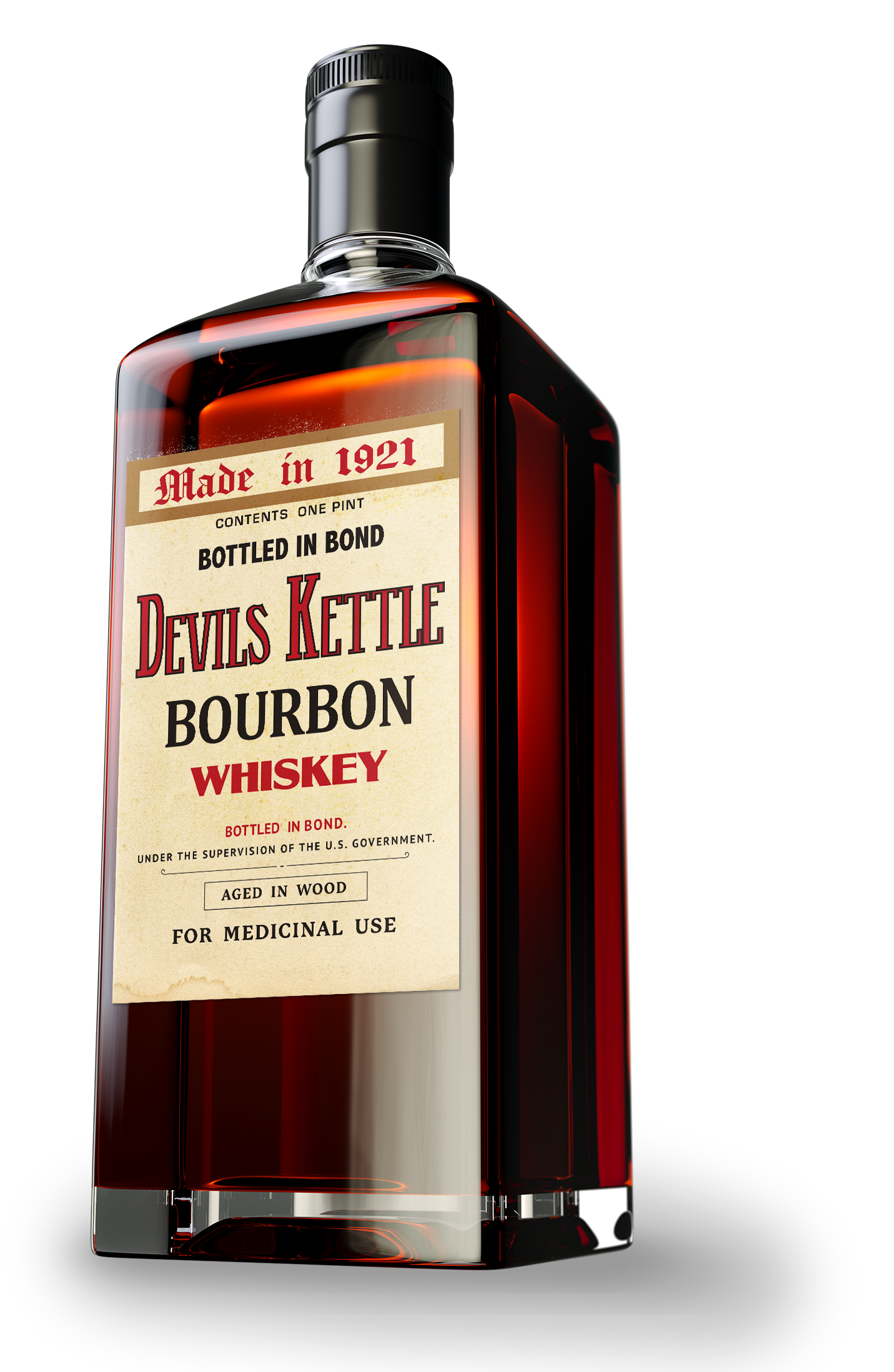
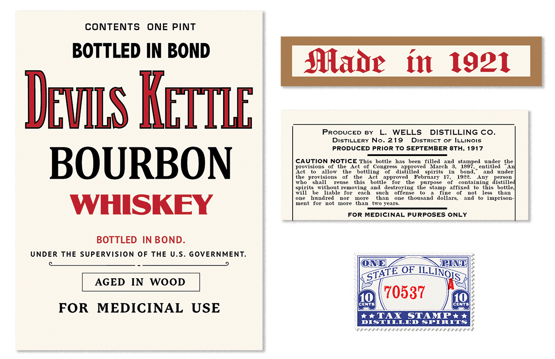
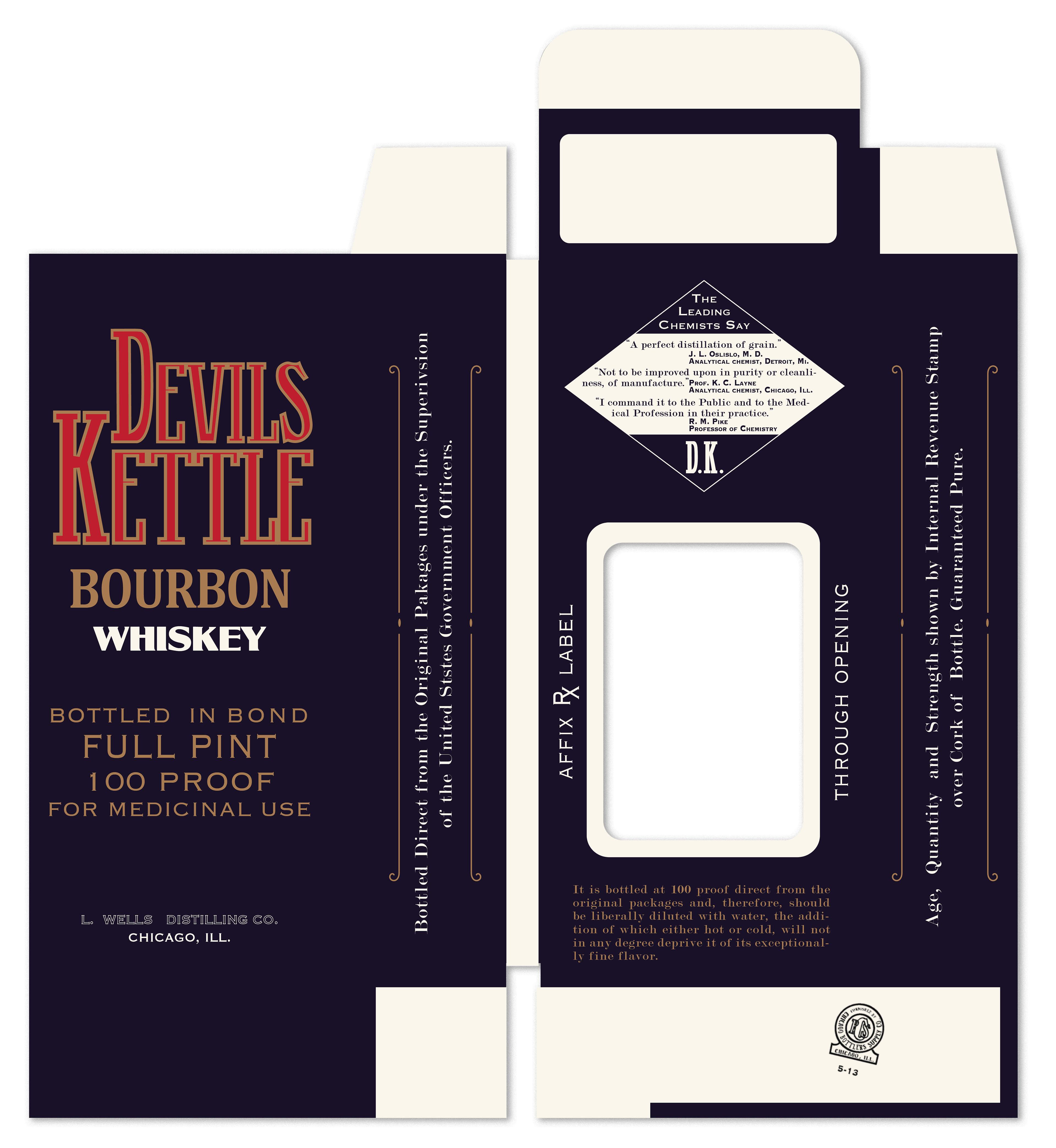
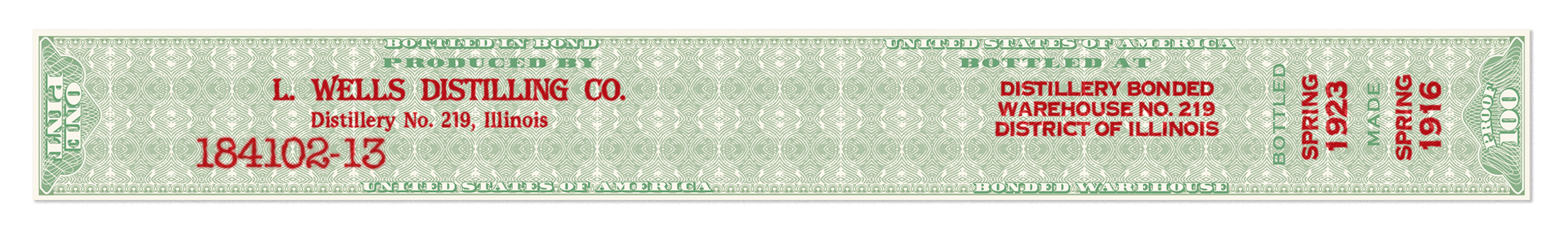
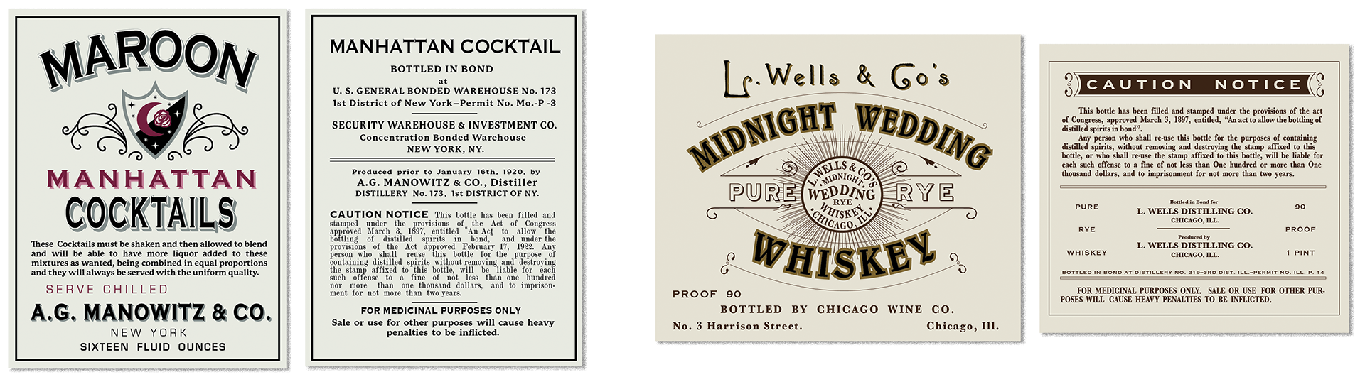
PROP GRAPHICS - LIQUOR BOTTLES, CIGARS, MEMBERSHIP CARD: what is a speakeasy without booze? Surprisingly, speakeasies weren't all that secret, and most in major cities had actual membership cards to track admittance. Al Capone was a major Chicago player, frequenter of speakeasies, and lover of Cuban cigars so there always had to be some on hand. Cigar box design, stamps, and individual stickers all researched + designed. Liquor bottle labels were often repurposed or sold as "medicinal" to bypass the anti-liquor laws, and featured multiple seals, tax stamps, and disclaimers. I designed a variety of front + back labels, bottle seals, and boxes to show the types of packaging you'd see during the time.
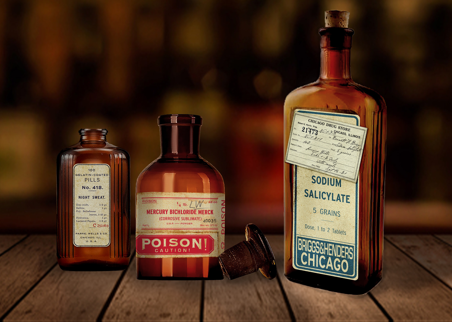
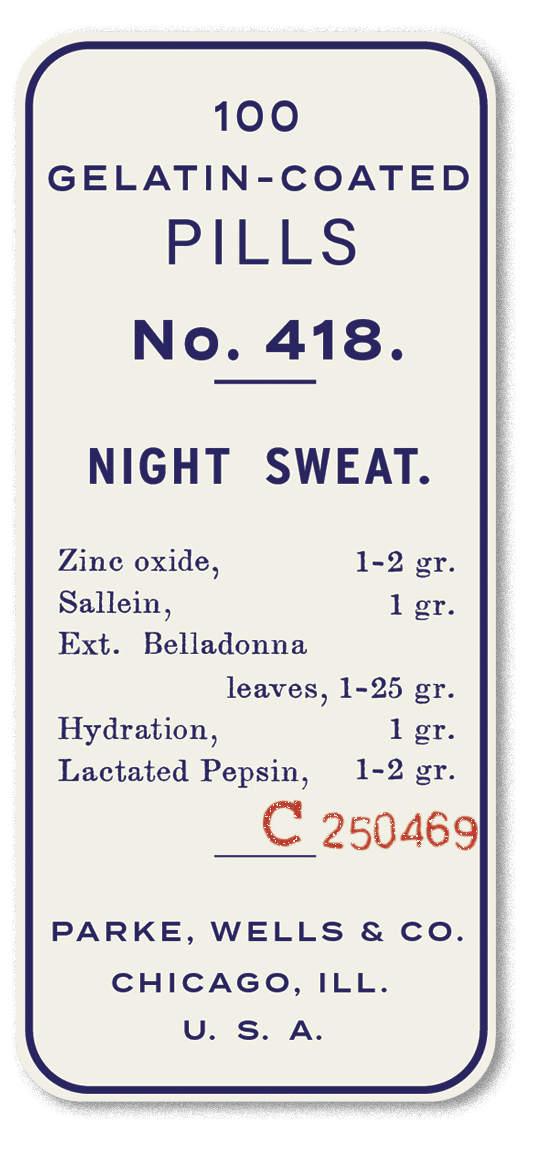
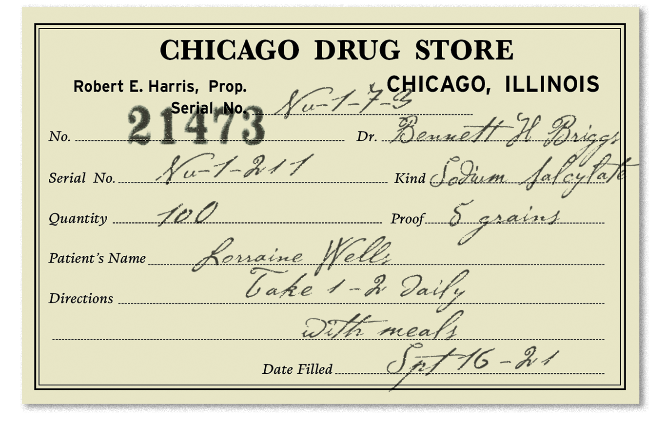
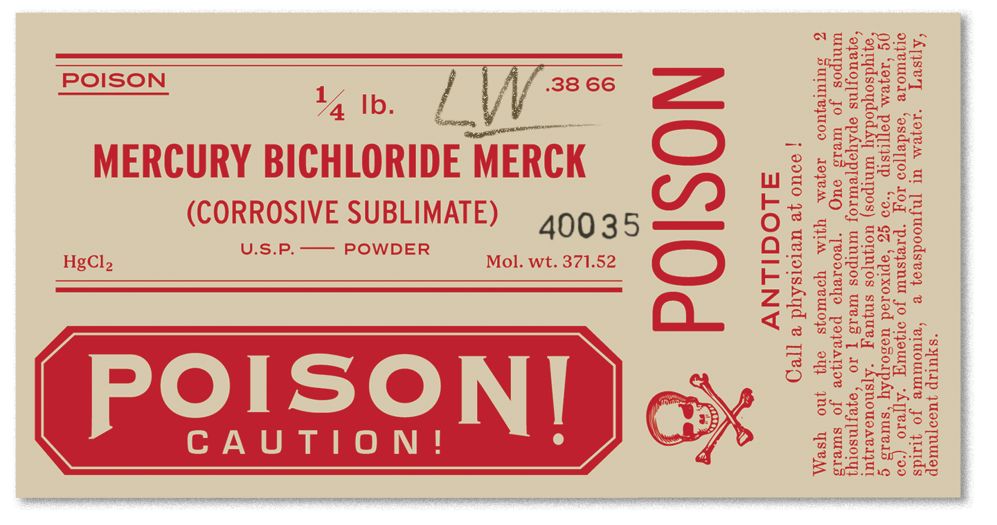
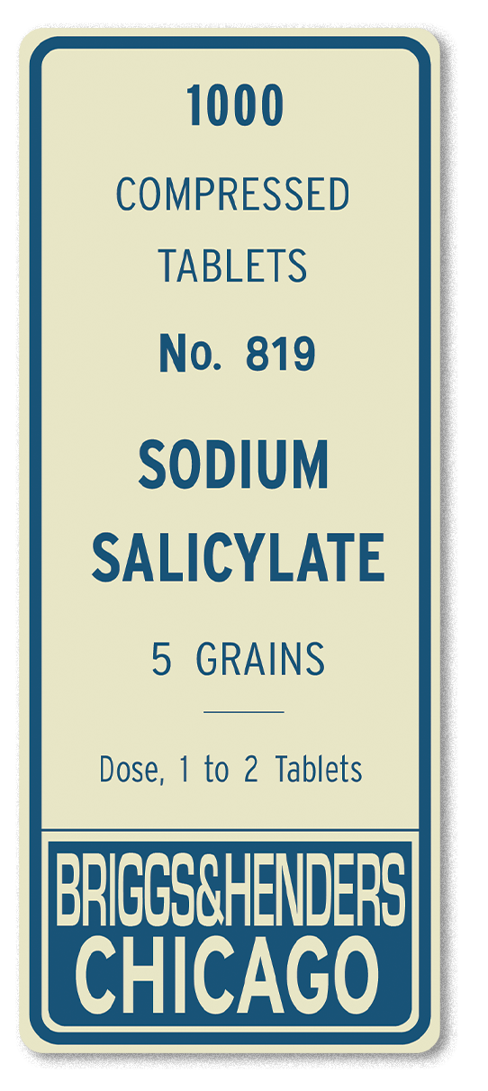
PROP GRAPHICS - PHARMACY BOTTLES + RX LABELS: Whether to for altruistic or insidious purposes, there is always a store of medication hidden behind the bar in the back office. You're only as trustworthy as the company you keep, and in this day and age you need the means to protect yourself in ways that are more undercover than the barrel of a shotgun. A variety of mundane to more nefarious medications from the time, in era accurate labels + written content completed with a RX label (which would be approximately 2x4" but is display smaller in the mockup). Complete with stamps, signatures, and discoloration from storage.
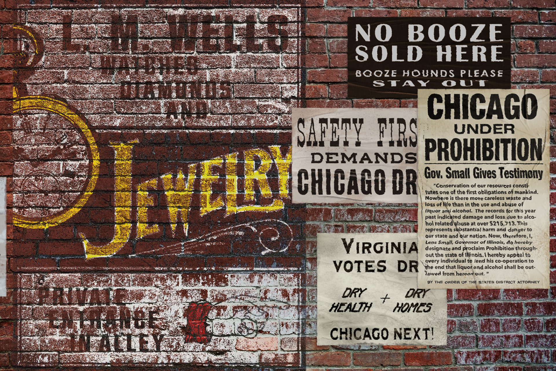
SCENIC GRAPHICS - PAINT + POSTERS: "Post No Bills" often was hard to enforce, as wheatpasted posters visualized the socio-political conversations of the time. A sampling of era-accurate recreated prohibition signs pasted on the brick alleyway wall, next to faded painting advertising the "private entrance" to the jewelry store on the main street that Lorraine operates as a front for the speakeasy.
1950s


1980s